
Yield Optimization Model for Crypto Exchange Treasury
A quantitative framework for allocating idle capital across traditional IDR instruments and on-chain DeFi protocols — built on CVaR optimization, two explicit risk layers, and live market data.
→ GitHub · Live Dashboard
The Problem
A licensed crypto exchange in Indonesia generates revenue primarily from trading fees. Between transactions, a portion of its own capital sits idle — not customer funds, which are legally segregated under POJK No. 27 of 2024, but house money above the regulatory equity floor.
The question is straightforward: what do you do with that capital?
The naive answer is to park it in a money market fund and move on. The more interesting answer is to ask whether a rigorous, risk-governed framework can extract better returns without exposing the business to tail risk it cannot afford.
This project builds that framework.
What the Model Does
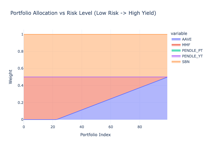
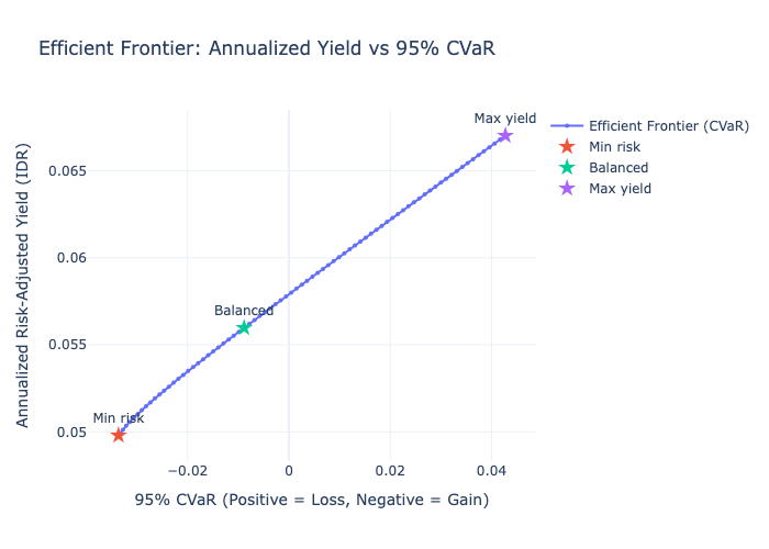
The model takes five yield-bearing instruments — two traditional IDR instruments and three on-chain USD protocols — and constructs an efficient frontier: a curve showing the best achievable return for every level of portfolio risk, from the most conservative allocation to the most aggressive one within defined constraints.
The output is three named portfolios sitting on that curve: Min Risk, Balanced, and Max Yield. Each represents a defensible, quantitatively grounded capital allocation decision.
What distinguishes this from a standard Markowitz portfolio model is two additional risk layers that traditional mean-variance optimization ignores entirely.
Why These Protocols
The two on-chain protocols were selected deliberately, not arbitrarily.
Aave is the anchor. It is the most battle-tested decentralized lending protocol by TVL, has the deepest USDC and USDT liquidity pools, and is the default reference point for on-chain stablecoin yield. Any serious treasury framework that includes DeFi exposure would start here. Excluding it would require justification. Including it requires none.
Pendle is the differentiation play. Rather than adding a second lending protocol — Morpho, Compound, or Spark would all produce a similar yield profile to Aave — Pendle introduces a structurally different yield category: fixed-rate yield stripping. PT and YT represent the interest rate market of DeFi. They behave differently from lending utilization rates, which is exactly what a portfolio model should want from a second on-chain instrument — genuine diversification, not correlation dressed as choice.
The Framework Is Open
The protocol universe is not locked. The pipeline’s first notebook (00_protocol_research) is designed as a research and onboarding layer — any protocol can be added by sourcing its exploit history, deriving a liquidity score, and feeding its yield series into the normalization layer.
Three protocols worth considering for an extended instrument universe, each representing a genuinely different yield category:
Ethena (sUSDe) — synthetic dollar yield backed by delta-neutral derivatives. Yield source is funding rates, not lending utilization. High in bull markets, sensitive to funding rate compression.
Maple Finance — institutional undercollateralized lending. Higher yield than Aave but carries credit risk rather than smart contract utilization risk. Relevant for treasuries comfortable with counterparty assessment.
Ondo Finance (USDY) — tokenized US Treasury yield, on-chain. Bridges the traditional/DeFi gap in the other direction — T-bill returns accessible from a treasury wallet. Increasingly relevant as tokenized RWA infrastructure matures.
Two Risk Layers Standard Models Miss
Layer 1 — Smart Contract Exploit Risk
On-chain protocols carry a risk that has no analog in traditional finance: the possibility of a protocol being exploited and funds being partially or fully lost. This is not captured in historical yield variance — exploits are rare, binary, and catastrophic when they occur.
The model quantifies this as an explicit expected loss haircut applied to each on-chain instrument before optimization:
Expected Loss = P(exploit) × SeverityP is derived from DeFiLlama’s hacks database — exploit count divided by protocol age in years. Severity is the fraction of TVL lost at the time of the exploit. Protocols with no exploit history receive a floor probability of 0.2% and a severity assumption of 80% — because absence of historical exploits does not mean absence of risk.
Off-chain instruments (SBN, MMF) receive zero exploit haircut. The asymmetry is intentional and correct.
Layer 2 — Liquidity Heterogeneity
Not all instruments can be exited at equal speed or cost. A money market fund redeems daily at NAV. A Pendle YT position requires selling on a shallow AMM where a $3M exit will move the price against you.
The model converts this into a basis point penalty mapped from a 1–5 liquidity score. Scores are derived from observable data — Aave utilization rate history, AMM pool depth relative to the exit size — not assigned as judgment calls. The resulting ladder:
| Instrument | Score | Penalty |
|---|---|---|
| MMF (RDPU) | 5 | 0 bps |
| SBN, Aave USDC | 4 | 5 bps |
| Aave USDT, Pendle PT | 3 | 15 bps |
| Pendle YT | 2 | 30 bps |
The two layers are kept separate deliberately. Folding exploit risk into the covariance matrix would understate it — historical yield variance does not tell you how often a protocol gets drained. Keeping them explicit makes the framework auditable.
Regime-Aware Stress Modeling
The model maintains two covariance matrices — normal and stress — and blends them before optimization.
Stress regime is triggered when Aave TVL drops more than 10% or Pendle TVL drops more than 15% over a rolling 7-day window, measured in token units rather than USD value to strip out price effects. Under stress, the model applies a 3x volatility amplification to on-chain instruments and forces all cross-asset correlations to a floor of 0.75 — reflecting the empirical reality that in a DeFi liquidity crunch, everything sells off together.
The blended covariance is 0.85 × normal + 0.15 × stress, embedding a 15% stress probability assumption consistent with historical crypto drawdown frequency.
This matters because the moment a treasury needs to redeem is precisely when on-chain liquidity dries up. A model that ignores stress-regime correlation is optimistic in exactly the wrong scenario.
What the Data Actually Said
The model was designed for a yield environment where Pendle offers 14–20% and creates a meaningful spread above Indonesian anchor instruments. Live market data told a different story.
Pendle YT returned -32% annualized. This is not a data error. YT holders earn the floating yield above the fixed PT rate implied at purchase. When actual protocol yield falls below that implied rate — which has happened as DeFi yields compressed — YT holders receive less than they paid for. The model correctly excluded YT from all portfolios. The 15% concentration cap remains in the architecture for future deployment.
Pendle PT implied APY was approximately 5%. After exploit and liquidity haircuts, PT nets out at 4.47% IDR — essentially equivalent to MMF and below SBN. The optimizer correctly treated PT as a near-zero allocation. A rational treasury does not take on DeFi complexity for a yield premium that has disappeared.
The practical result: in the current environment, the only meaningful yield enhancer above the IDR anchor is Aave, at approximately 7.93% IDR after haircuts. The efficient frontier spans 4.98% to 6.70%.
That is a narrow range. It is also an honest one.
The model did not produce a prettier result by adjusting assumptions to fit a desired output. It surfaced what the market data says and documented why — which is what a treasury framework is supposed to do.
Current Results
| Portfolio | Expected Return (IDR) | 95% CVaR | Aave Exposure | MMF + SBN |
|---|---|---|---|---|
| Min Risk | 4.98% | -3.35% (tail gain) | 0% | ~100% |
| Balanced | 5.60% | -0.91% (tail gain) | ~18% | ~82% |
| Max Yield | 6.70% | +4.17% (tail loss) | ~50% | ~50% |
CVaR is reported using the practitioner sign convention: negative means the portfolio remains profitable even in the worst 5% of scenarios. Positive means an expected tail loss of that magnitude
Technical Stack
The pipeline runs end-to-end in Python across six sequential notebooks. Core dependencies are cvxpy for convex optimization (CLARABEL solver), pandas and numpy for data handling, and plotly for visualization.
Yield data is sourced from DeFiLlama’s API for Aave and hack history, Pendle’s native API (api-v2.pendle.finance) for PT and YT yields — DeFiLlama does not cleanly separate PT from YT pools — and manually from Bank Indonesia, DJPPR, and OJK fund factsheets for the Indonesian instruments.
Model parameters including exploit probabilities, liquidity scores, and return caps are stored in protocol_params.json with documented rationale. Nothing is hardcoded in pipeline scripts.
Limitations
This is a live model, not a backtest. Results reflect market conditions as of the data fetch date. In a higher-rate DeFi environment, the same framework would produce a materially different frontier with Pendle actively contributing. The architecture handles that without modification — only the inputs change.
The CVaR estimate relies on synthetic scenario sampling from the blended covariance matrix. If tail dependence is stronger than the model assumes — a known limitation of Gaussian copulas — CVaR will be understated. The 0.75 stress correlation floor is a conservative countermeasure, not a complete solution.
Manual data inputs (SBN yields, RDPU NAV, USD/IDR rate) require human sourcing. The model does not validate freshness of these inputs. That is an operational control that sits outside the pipeline.
Source Code
The full pipeline, data, and outputs are available on GitHub.
→ github.com/alfajr666/yield-generation-model-sample
Results are based on live market data and modeling assumptions as of the data fetch date. Nothing here constitutes financial advice.